
Do it yourself: CSS für Profil und Blog
6.834 Beiträge ▪ Schlüsselwörter:
Allmystery, Hilfe, Welt ▪ Abonnieren: Feed E-Mail

Do it yourself: CSS für Profil und Blog
17.06.2012 um 02:36
Do it yourself: CSS für Profil und Blog
17.06.2012 um 02:37wasne kacke :D
Do it yourself: CSS für Profil und Blog
17.06.2012 um 22:35Hi,
hier n`bissl was zum basteln:
<iframe height="500px" src="http://bluebuddha.cwsurf.de//indexht.html§quot; width="580px"></iframe>
CSS & HTML dazu:
CSS:
HTML:
hier n`bissl was zum basteln:
<iframe height="500px" src="http://bluebuddha.cwsurf.de//indexht.html§quot; width="580px"></iframe>
CSS & HTML dazu:
CSS:
#frame {
-moz-perspective: 1000px;
border: 1px solid #000000;
border-radius: 10px 10px 10px 10px;
height: 200px;
margin-left: 40%;
margin-top: 100px;
position: absolute;
width: 150px;
z-index: 1;
}
#frame a {
color: #ffffff;
}
#frame_card {
-moz-transform-style: preserve-3d;
-moz-transition: all 2s linear 0s;
-webkit-transform-style: preserve-3d;
-webkit-transition: all 2s linear 0s;
-o-transform-style: preserve-3d;
-o-transition: all 2s linear 0s;
-ms-transform-style: preserve-3d;
-ms-transition: all 2s linear 0s;
transform-style: preserve-3d;
transition: all 2s linear 0s;
border-radius: 10px 10px 10px 10px;
height: 100%;
width: 100%;


animation-name:roomy;
animation-duration:5s;
animation-timing-function:linear;
animation-delay:2s;
animation-iteration-count:infinite;
animation-direction:alternate;
animation-play-state:running;

-moz-animation-name:roomy;
-moz-animation-duration:5s;
-moz-animation-timing-function:linear;
-moz-animation-delay:2s;
-moz-animation-iteration-count:infinite;
-moz-animation-direction:alternate;
-moz-animation-play-state:running;

-webkit-animation-name:roomy;
-webkit-animation-duration:5s;
-webkit-animation-timing-function:linear;
-webkit-animation-delay:2s;
-webkit-animation-iteration-count:infinite;
-webkit-animation-direction:alternate;
-webkit-animation-play-state:running;

-o-animation-name:roomy;
-o-animation-duration:5s;
-o-animation-timing-function:linear;
-o-animation-delay:2s;
-o-animation-iteration-count:infinite;
-o-animation-direction:alternate;
-o-animation-play-state:running;

-ms-animation-name:roomy;
-ms-animation-duration:5s;
-ms-animation-timing-function:linear;
-ms-animation-delay:2s;
-ms-animation-iteration-count:infinite;
-ms-animation-direction:alternate;
-ms-animation-play-state:running;

}
#frame:hover #frame_card, #frame.hover_effect #frame_card {
-moz-transform: rotateY(180deg);
-webkit-transform: rotateY(180deg);
-o-transform: rotateY(180deg);
-ms-transform: rotateY(180deg);
transform: rotateY(180deg);
box-shadow: 0px 0px 0px #00ccff;

-moz-animation-name:none;
-webkit-animation-name:none;
-o-animation-name:none;
-ms-animation-name:none;
animation-name:none;

}
.topstock {
-moz-backface-visibility: hidden;
-webkit-backface-visibility: hidden;
-o-backface-visibility: hidden;
-ms-backface-visibility: hidden;
backface-visibility: hidden;
border: 1px solid #00CCFF;
border-radius: 10px 10px 10px 10px;
box-shadow:0px 0px 50px #00ccff;
height: 100%;
position: absolute;
width: 100%;}
.topstock.back {
-moz-box-sizing: border-box;
-moz-transform: rotateY(180deg);
-webkit-box-sizing: border-box;
-webkit-transform: rotateY(180deg);
-o-box-sizing: border-box;
-o-transform: rotateY(180deg);
-ms-box-sizing: border-box;
-ms-transform: rotateY(180deg);
box-sizing: border-box;
transform: rotateY(180deg);
background-color: #000000;
border: 1px solid #00CCFF;
border-radius: 10px 10px 10px 10px;
color: white;
opacity: 0.6;
padding: 10px;
text-align: center;
width: 150px;
text-shadow:0px 0px 5px #00ccff;}
.front topstock img {padding:30px;}
#ima {
background-attachment: scroll;
background-clip: border-box;
background-color: transparent;
background-image: url("http://www.deluxe-stylez.de/wp-content/uploads/2011/12/Backtrack-Black-Dragon-Wallpaper.jpg");
background-origin: padding-box;
background-position: 0px 10px;
background-repeat: no-repeat;
background-size: 150px auto;
}
#ima a {color:#ffffff; text-align:center;}
#mo {color:#ffffff}

@-moz-keyframes roomy
{
0% {-moz-transform: scale(1, -1)}
25% {-moz-transform: scale(1, -0.5)}
50% {-moz-transform: scale(1, 0)}
75% {-moz-transform: scale(1, 0.5)}
100% {-moz-transform: scale(1, 1)}
}

@-webkit-keyframes roomy
{
0% {-webkit-transform: scale(1, -1)}
25% {-webkit-transform: scale(1, -0.50)}
50% {-webkit-transform: scale(1, 0)}
75% {-webkit-transform: scale(1, 0.5)}
100% {-webkit-transform: scale(1, 1)}
}

@-o-keyframes roomy
{
0% {-o-transform: scale(1, -1)}
25% {-o-transform: scale(1, -0.5)}
50% {-o-transform: scale(1, 0)}
75% {-o-transform: scale(1, 0.5)}
100% {-o-transform: scale(1, 1)}
}


@-ms-keyframes roomy
{
0% {-ms-transfmsrm: scale(1, -1)}
25% {-ms-transfmsrm: scale(1, -0.5)}
50% {-ms-transfmsrm: scale(1, 0)}
75% {-ms-transfmsrm: scale(1, 0.5)}
100% {-ms-transfmsrm: scale(1, 1)}
}


@keyframes roomy
{
0% {transfmsrm: scale(1, -1)}
25% {transfmsrm: scale(1, -0.5)}
50% {transfmsrm: scale(1, 0)}
75% {transfmsrm: scale(1, 0.5)}
100% {transfmsrm: scale(1, 1)}
}
HTML:
Make


a


choice


[url=http://www.allmystery.de/]>> Wake up <<[/url]
or
[url=http://www.allmystery.de/]>> die slow <<[/url]
Do it yourself: CSS für Profil und Blog
17.06.2012 um 22:42PS: Wenn die Karte in Ihrer Ausgangsposition ist verändert sich der Hovereffekt.
Do it yourself: CSS für Profil und Blog
19.06.2012 um 14:58Kann mir bitte jemand sagen wie man GB mittig platziert??
Danke für die Mühe :)
Danke für die Mühe :)
Do it yourself: CSS für Profil und Blog
19.06.2012 um 15:18@Keysibuna
Schock... So ne Frage von dir?
h2 {
display: inline;
font-size: 14px;
margin-left: 35%; /* nach Bedarf verschieben */
}
ul#gb_posts {
display: block;
list-style-position: outside;
list-style-type: none;
margin: 0 auto;
padding: 0;
width: 650px;
}
#gb_post_wrap {
height: 90px;
margin: 0 auto;
position: relative;
width: 650px;
}
Do it yourself: CSS für Profil und Blog
19.06.2012 um 15:21Do it yourself: CSS für Profil und Blog
19.06.2012 um 15:23Für css muss man nicht bei der Sache sein.^^ Man schlägt im Halbschlaf einfach wild auf der Tastatur rum.
Do it yourself: CSS für Profil und Blog
19.06.2012 um 15:24Arbeitest du manuell mit dem Quellcode der Seite oder mit einem Live Plugin?
Do it yourself: CSS für Profil und Blog
19.06.2012 um 15:29Do it yourself: CSS für Profil und Blog
19.06.2012 um 15:53Oh oh oh.
Nimm Firebug oder was vergleichbares für deinen Browser.
Damit klcikst du auf das Element und erhälst sofort alle CSS Einstellungen und kannst sie bearbeiten. Wenn das Ergebnis gefällt kopierst du einfach den ganzen Block.
Nach einem Refresh ist alles wieder unverändert.
Nimm Firebug oder was vergleichbares für deinen Browser.
Damit klcikst du auf das Element und erhälst sofort alle CSS Einstellungen und kannst sie bearbeiten. Wenn das Ergebnis gefällt kopierst du einfach den ganzen Block.
Nach einem Refresh ist alles wieder unverändert.

Do it yourself: CSS für Profil und Blog
19.06.2012 um 15:54Do it yourself: CSS für Profil und Blog
19.06.2012 um 15:55Ok.
Wahres Heldentum.
Wahres Heldentum.
Do it yourself: CSS für Profil und Blog
19.06.2012 um 15:56Absolut ;)
Do it yourself: CSS für Profil und Blog
19.06.2012 um 15:59Das hab ich gerade gesehen :) Werde mir anschauen, danke @-------- schrieb:Nimm Firebug oder was vergleichbares für deinen Browser.
@dog
Sehr gerne, aber meiste Arbeit hat eigentlich @---- gemacht :D
Do it yourself: CSS für Profil und Blog
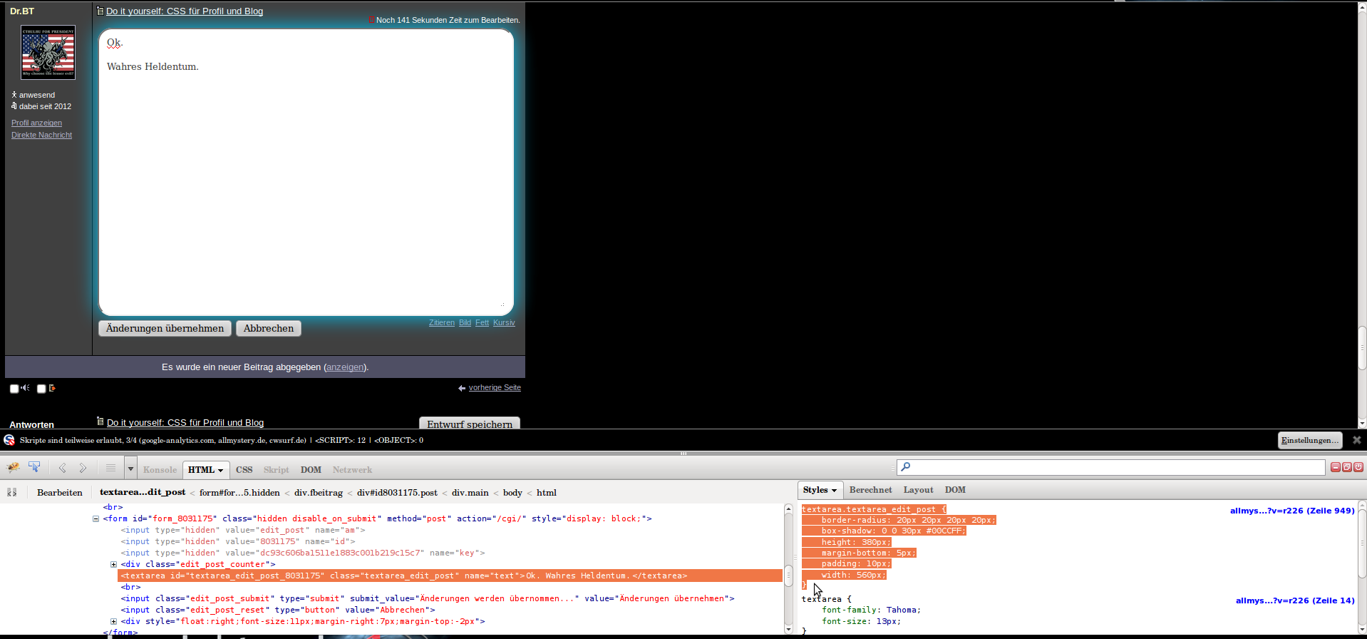
19.06.2012 um 16:12Firebug:
Hab hier das Edit-Textfeld verändert. Eigentlich wäre es nur textarea. Also die klasse darunter.:)
Immer schaun wo der Cursor ist:
1.Firebug Auswahl aktivieren:
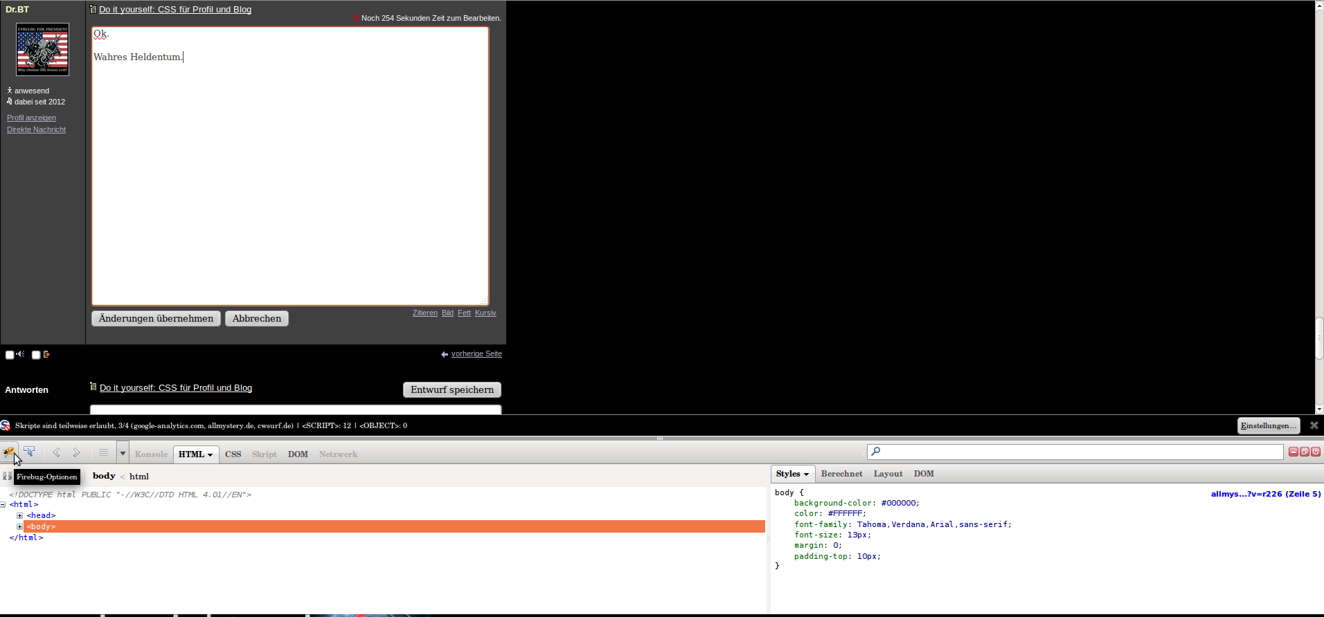
2.Element hovern und anklicken:
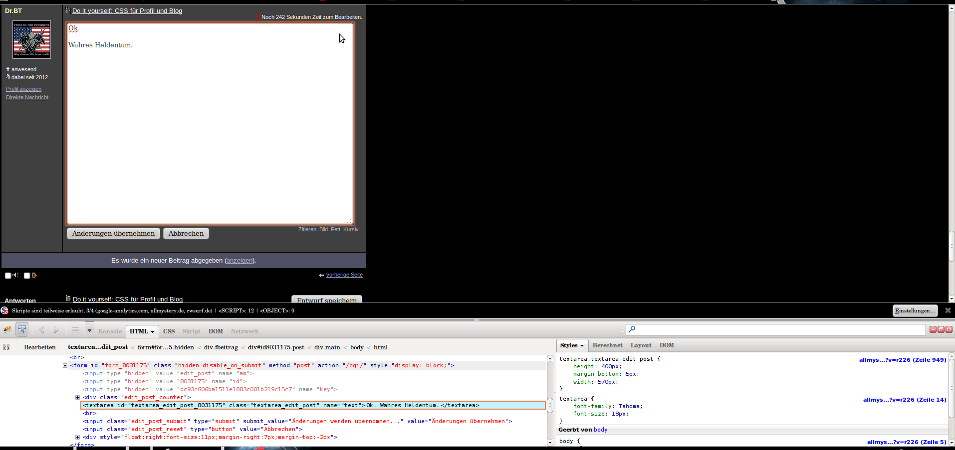
3. CSS EInstellungen rechts bearbeiten:

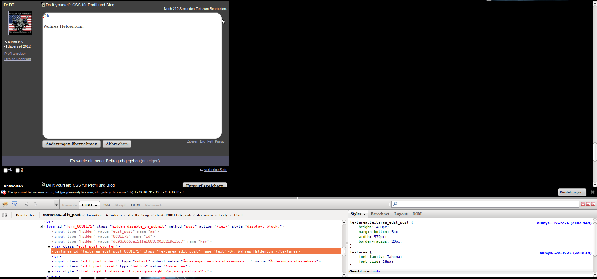
4. Block einfach kopieren:
PS: Du kannst auch das html ändern und Javascript etc.
Wenn du in der rechten Spalte rechts auf den blauen Link klickst wird das komplette CSS der Seite angezeigt.
Hab hier das Edit-Textfeld verändert. Eigentlich wäre es nur textarea. Also die klasse darunter.:)
Immer schaun wo der Cursor ist:
1.Firebug Auswahl aktivieren:
2.Element hovern und anklicken:
3. CSS EInstellungen rechts bearbeiten:
4. Block einfach kopieren:
PS: Du kannst auch das html ändern und Javascript etc.
Wenn du in der rechten Spalte rechts auf den blauen Link klickst wird das komplette CSS der Seite angezeigt.
Do it yourself: CSS für Profil und Blog
19.06.2012 um 16:31Denke damit kann jeder sein Profil nach kurzem einarbeiten selbst handhaben. :)
Do it yourself: CSS für Profil und Blog
19.06.2012 um 18:44Hey :)
Ich hab mal ne Frage;
und zwar habe ich meinen Header mit dem Code hier verschoben:
.header {left: 68px; top: 33px;}
Hat ja auch geklappt. Aber wieso funktioniert der Code nicht bei (z.B.) .profile_info?
Ich hab mal ne Frage;
und zwar habe ich meinen Header mit dem Code hier verschoben:
.header {left: 68px; top: 33px;}
Hat ja auch geklappt. Aber wieso funktioniert der Code nicht bei (z.B.) .profile_info?
Do it yourself: CSS für Profil und Blog
19.06.2012 um 19:04Das funktioniert nur in Kombination mit:
position: relative;
oder
position: absolute;
Absolute benutzt den Body zur orientierung. Sprich left:0;top:0; wäre die oberste linke Ecke.
relative benutzt das nächst höher gelegene Element zur Orientierung.
setz folgendes in den profile_info CSS Block:
position:relative;
top: 0px;
left:100px;
Du kannst auch negative Werte nutzen.